General UI Annoyances + Some bugs
I'm on Windows 10, on version 3.1.3.1 beta of the X1 Control Panel software
These are my annoyances with the ui and, in some cases, what I think could be done to improve the ui and interacting with it
These are my annoyances with the ui and, in some cases, what I think could be done to improve the ui and interacting with it
I generally feel that the name expert mode and Simple Mode are wrong, as neither feels better than the other. Both have features that the other does better, as well as features that the other does not have. I find myself constantly swapping between the 2 as it is not possible to do everything within one menu.
Simple mode | Expert Mode | |
Pros |
|
|
| Cons |
|
|
I really do believe that if I could use the Expert mode mapping editor in simple mode, I would just use simple mode, as for the most part it does what expert mode does but better, but because the simple mode editor is so unusable, I am essentially forced into using the expert mode editor. Neither simple mode nor expert mode feels complete to me; they both feel like one is missing something from the other and vice versa
Why is the edit icon not in a consistent place? It makes it very annoying to press when I want to edit something else. I feel like a perfect place for it would be underneath the 3-dot hamburger menu, and it would always be visible


I can't rearrange subprofiles in expert mode, only in simple mode, nor can I right-click and edit a subprofile in expert mode. I have attached a video of the right-click menu not working on subprofiles in expert mode. And the small hamburger menu can be used to do some things but not everything.
When in simple mode, it is really annoying to move profiles in and out of parents. If I want them ordered left to right, the only way to get a profile put as rightmost is to drag it to second last, then drag the last item over to the left. It would just be nice if, when I am obviously dragging a profile to the end, it actually dragged in. I have a video attached of me demonstrating this
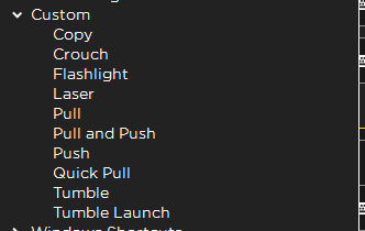
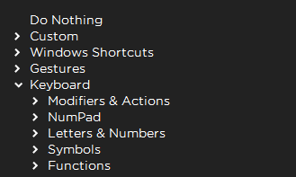
I can't figure out how to delete macros I have given an action name and saved, as there is no obvious way to do this. I have also attached a video for this one, but in general, the way the action sets are displayed is not very good, as it is just a list of all actions I have ever saved. It would be cool if, instead of just a single dropdown called custom, there were dropdowns for each profile with a sub-dropdown for each sub-profile. Similar to how it is done for the keyboard action set
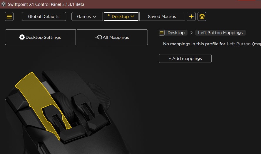
It would be nice to have the button I am editing be highlighted in expert mode, as it feels very much like the mouse on the left is just a decorative menu for adding mappings to different buttons. Probably in yellow, as that is the same colour used to highlight the currently active mapping and this is already done when the user clicks on a specific button on the right
to further it, when just hovering over the button on the left or a mapping on the right, why not highlight the button blue, for example, to show the user the button they are hovering over already has a mapping/ where that mapping is in the list.
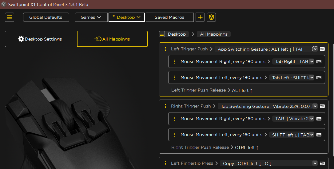
to further it, when just hovering over the button on the left or a mapping on the right, why not highlight the button blue, for example, to show the user the button they are hovering over already has a mapping/ where that mapping is in the list.
Why is it not possible to add a mapping for an unmapped button from the all mappings page? There could be a button below or above the remove button that, when pressed, opens a dialogue where the user selects the buttons they want to add a mapping to, as the only way at the moment is to click the button with the mouse and press add mapping, where I then go back to the all mappings screen anyway
When you create a new profile in expert mode and link an app to it, it does not grab the icon. Only if the app is linked in simple mode does it grab the icon, meaning when I go back into simple mode, I have to open the game, unlink and relink the game with the profile for the icon to be grabbed

Why can I only add 2 mappings for tilt amount? It just doesn't seem to make sense that I can't go past 2. Is there a reason, or just an arbitrary restriction?
The same for nested profiles: is there a reason I can only have a nested profile 1 level deep? I have a games profile where all the games I have go in, but it would be nice to have another subprofile for different characters, like in Marvel Rivals. A profile for Spider-Man, one for Doctor Strange, but i cant if I want to do that. I have to take the Rivals profile out of Games, then copy over the global stuff I had for Games, then make the sub-profiles specifically under Rivals.
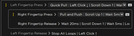
There is a lot of bloat here. I have named the action so that I know and remember what it does; there is no need for it to still show anything after Quick Pull or Pull and Push, nor show the release button, as I have it set up so I can see the press and release at the same time. All it ends up being is text bloat that makes it harder to actually see what a button does; in this way, the simple mode does it better
The remove button makes the entire menu freak out for me. I've attached a video of it. I believe this is because I have my display's scale set to 125% in Windows settings.
Apologies if this came off a bit ranty, but it's just essentially everything that has annoyed me with the ui since I started using it, although it's still years ahead of Logitech G HUB, that software is a steaming pile of garbage
Apologies if this came off a bit ranty, but it's just essentially everything that has annoyed me with the ui since I started using it, although it's still years ahead of Logitech G HUB, that software is a steaming pile of garbage